skip to main |
skip to sidebar

Shinzi Katoh is Japan’s best known Zakka artist and illustrator/designer (read more about him in here). His illustrations style is still very 70's, which I quite fond of it. I fall in love the most with his due caffe mug. It's such a clever concept, top for my biscuits and below for my tea. No more hassle carrying my tea and biscuits through the stairs and opening doors in the office -_-"

I first saw the mug at Melbourne design exhibition, months ago. I wasn't aware about Shizi Katoh at that time and thinking about the hassle carrying breakable items back to Brisbane, so I neglect the idea of buying the mug. But when I accidentally found the mugs again, I promise my self to get one of this. Seriously, I was like a mad cat lady (from the Simpsons) when I saw the whole collections of Shinzi Katoh. It was the first time I was introduce to Zakka — the things that make people feel happy and exist like a comfortable air. Now, I trully understand why Japanesse do lots of cute unnecessary stuff.

I would recommend you to grab Shinzi Katoh items from here, UK site and the original Japanese site, here. Both have the best range of Shinzi Katoh collections. You will need this guide to shop in Japanesse site unless you can read Kanji (thanks to Charlotte from anknel and burblets). If you still can't get enough of it, check Shinzi Katoh flickr group here.
Tell me which one is your favourite? … I know it's so hard to pick. I hope my sister would get me one for my Birthday, next month. I'll let her decide ^^
"Clap your hands if you love swiss design"
quoted from Grain Edit.
I say bow if you can. I don't think there's any other best words to describe it. Swiss design is just so brilliant and timeless. Others might say it's so retro but I don't agree with it. No matter how much design trends evolve, I love Swiss design till death set us apart.
And it will be just a matter of time, I'll colect all Swiss design books, especially Josef Muller Brockmann. He is totaly my design hero. He has inspired me from the beginining I started doing design.
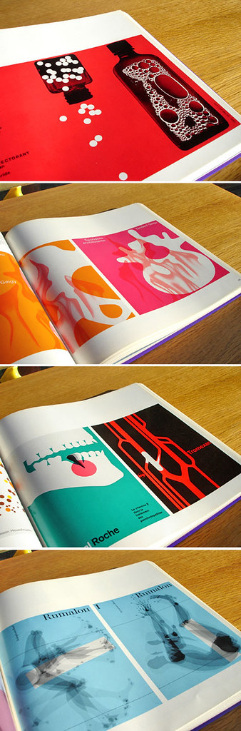
Why can't we just design our chemistry text book like that!!!
Image from Publicity and Graphic Design in the Chemical Industry by Hans Neuburg 1967, via Grain Edit. To see more of the images visit Grain Edit flickr set.

Uhhh ahhh… I totally love the shots by Jess Bonham, it's really cool!
Apart from my busyness, these colours just 'POPin' my creative minds. I wonder if I could use this fluoro colour for the next publication design :P hmmm…
Seen first via Happy Cavalier

I chuckled when I saw this t-shirt. Wow! this is so perfect. It's witty and cute, but straight to the point at the same time. My sister has been like that, honestly I can't remember when she was being positive.
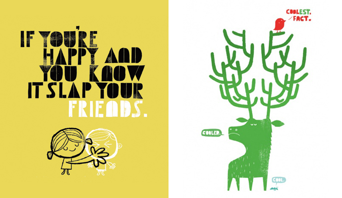
This is the other t-shirt that I like too. It's illustrated by Adrian Johnson, I'll post more stuff about him. You can all buy the t-shirts from here. If you are in the States, you're lucky, you'll get free shipping if you buy 3 or more t-shirts.
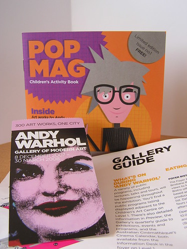
I've been wondering who's the talented designer who creates the amazing characters at Queensland Art Gallery (QAG) and Gallery of Modern Art (GOMA). The very recent/most popular exhibition is Andy Warhol exhibition. I am sure most of Brisbane art/design lovers had visited this exhibition. You may recalled there are some wacko Andy Warhol's character appears in some of the walls, explains few bits more of his works. Then if you are a hoarder like me, you might grab the cute square children's activity book (the picture shown). All those nice illustration is actually designed by Fiona-Lee (a.ka. Bonsai Foi), the inhouse illustrator/designer at the QAG/GOMA.
I believe she has been working there for couple years by now. She has been behind all the great characters created in every exhibitions for kids. From the famous turtle mascot for Asia–Pacific Triennial of Contemporary Art exhibition to the Yayoi Kusama exhibitions (the dots), there're also the cat, the gnome, the bug and not to forget the bat from other exhibitions. The list can just go on, please check her websites or her flickr set.
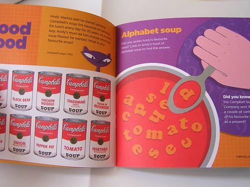
I wish I could do work as fun as hers. ps: I think she is my work mate's (a.k.a marshmallow cat) best friend, who her self is very talented illustrator too. I found it over flickr, yesterday morning.
This post is a continuation from my Spot it on post about similarity on two cover design. Quite awhile ago, I actually found out where the originality of the modular shape used in both covers. It was actually came from a suite of a stocks illustrations from stockbyte. I was quite disappointed by the fact that the designer just used a stock of illustrations as it is in the cover. Although, the whole stocks wasn't really bad, it is very psychedelic! '60s-style pop art. If you are interested you can buy it from gettys or fotosearch.
What do you think as a designer buying a stock of illustrations? Do you think its inappropriate? Would you consider its a sign of slackness of the designer to be creative? Especially when there's no further manipulation being done. What is the good excuse as designer to buy it?


