
Let me show you one of my favourite cover that I worked on. Although, in the end, it wasn’t quite the perfect cover I wanted to be. But hell yeah, I had fun and that’s what important: The process.
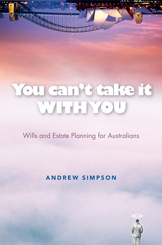
You can’t take it with you is a trade book about managing your wealth before you go to the better place. It provides advices on how to make a good will and etc. Above is my first concept. I like it how surreal it looks like. Everyone at the studio had a chuckled about this cover. The concept is about heaven and earth. The man with white suits, which reminds me of Morgan Freeman at Bruce Almighty movie. He is either being happy for what he have done or was looking back his life with regrets. I guess, you need to read the book if you wanted to be happy and RIP.
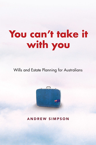
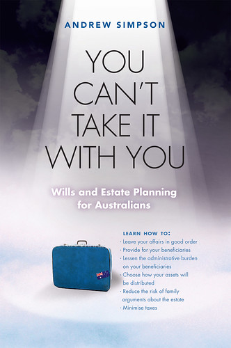
After reassessing the cover, I decided not to send through the first idea. So came up with the second one. This is relates about travelling. Mind you, this book is only for Australian market thus there’s some Australian icons incorporated in the cover. I thought this was pretty darn good and would hit the jackpot! But sadly, turned down by the publishing editor. They completely dislike the travel angle since it could be misleading as a travelling book. They got their points.
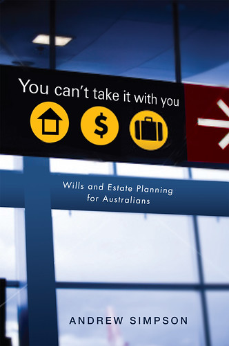
So back reworking the cover again. Received their suggestions, this is pretty much what they said “try to make it more simple like just pen and paper. Or look death in more metaphorical sense, perhaps a road leading into a white light”. Oh, how hard could it be (yes, it’s very common to receive a contradict comment. At this stage, they are desperate to get the right cover. They pretty much don’t know what they want). Luckily, I still had my patience and I was actually getting more excited. Hmm… a road leading into a white light… Aha! This is what I came up.
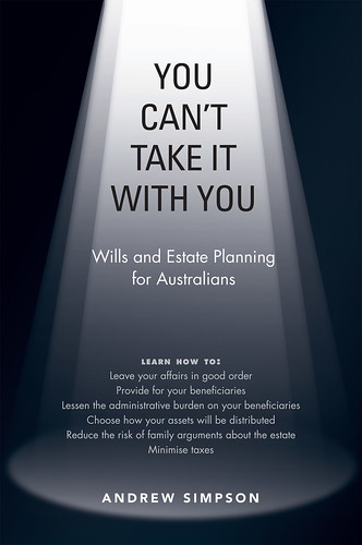
Remind you of something? It’s from Mr. Bean opening title. I really like it a lot, it’s brillant! Stronger than the original concept. I came up with more ideas, but they weren’t great. It was just showing what they’ve asked for.
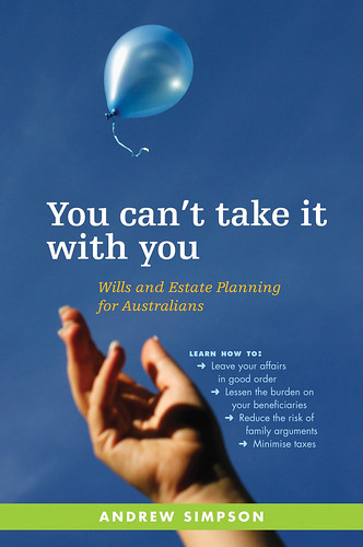
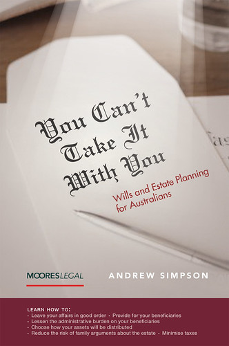
But it wasn’t there yet. So I went to do more traditional approach, searching for stock photos. Then this came along. For the last draft, I only sent this one cover and they LOVE it! Even the author was so pleased. It wasn't the most exciting cover but it's an appropriate cover for what it meant for.
The rationale: Letting go ballons is certainly becoming a more common ritual at funerals. And there are plenty of other ties such as 'letting go'. It’s probably more common at younger people's funerals, but we are banking on the fact that most people don't think of themselves as old or near to dying. And a prime market for this book is definitely the 30s and 40s with young kids. Since Many of these parents probably haven't already done a will. (I am on mid 20's and I’ve already got my will and my self insured. Although, I just wish I had my income protection insurance as well, sigh…).
ps: this post had been on a draft for ages, since 10/02/09. I just haven't got the time to post the images yet. And, just incase it might cost me loosing my job :P But you know what?! I already HAVE!
So what do you think? Tell me your opinions? Should I put the whole process into my portfolio?
1 comment:
weeeeee! <3 I love the 2nd design.
Post a Comment