
I am running out of ideas to put in inside the end of the year exhibition catalogue. Well, the space is 145mm deep x 105mm wide, it’s really like an ad space in the magazine. The main purpose of the catalogue is to showcase all the students works and also for quick reference book to find graduates. Last year, I took photograph of my works, which is different from other people. Mostly they used vectors works and scramble in together. Unfortunately, my photos were taken badly, the colours were awful.
Now, I can’t decide which way to go. I admit that I’m not prepared to take photograph of my new works, afraid that it might not come out well since the work is very minimalist publication. I bet that other students going to display their work in tiny details. I really wanted to look different. What do you feel when you open a book that has massive details of works from every different students? I will absolutely overwhelm and just keep skipping the page, not bother seeing the works. Oh, some people might just put one of their best works, which sometimes it turns out that it’s not really a great work.
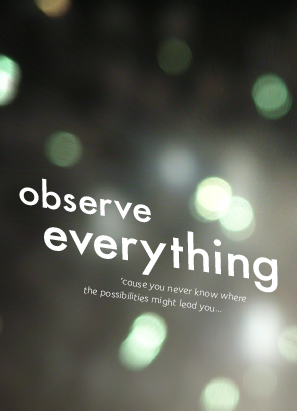
I’ve got other idea that I like better but it’s more edgy and might not work at all. So yea still working on it… The photo on the background I took it by myself on the RiverFestival. It’s the details from the fireworks. Lovely isn’t it? I have been using the photos for my desktop wallpaper.
No comments:
Post a Comment