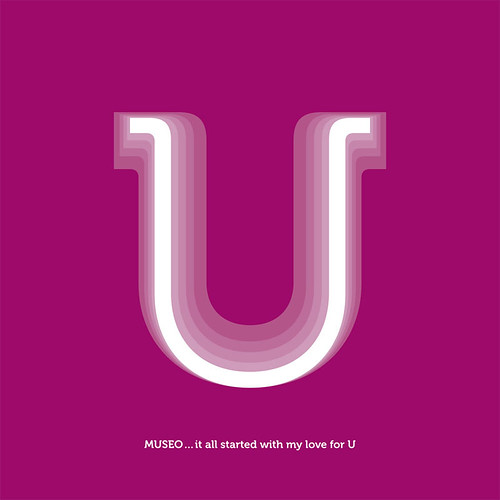
I fall in love with MUSEO at the first sight when I saw it at MyFonts Newsletter and this. I can see how a publication would look beautiful just set in MUSEO, both display text and body text. My only regret is, it doesn't contain the italic version since it has came with such a variable weight family. They have 5 different weights, 2 are payed and 3 of them is free, available from MyFonts of total $29 (USD) only!!!. Not to mention that it has lots of open type features, like a lovely ligatures. I just could not resist the beauty of this typeface, and I bought them. Even though, I have no projects to use this typeface yet (I haven't been doing any freelance anymore). At least, I could play around with it then I'll convince the company that I've been working on to buy this worthy typeface :D.
In my opinion, MUSEO is quite a sensible semi-serif typeface that would give a nice and sweet feels as body text. Its roundness make it a good pair with typefaces like Avenir as sans. Nonetheless, the look of MUSEO is quite related to the new ARCHER from H&FJ., PMN Caecilia, and the most similar is probably with Montag then perhaps Estilo text. They are all speak in the same language but yet each is quite individual. Hence, I love MUSEO the most, perhaps its looseness and warmness look that drawn me into it, which reminded me how I love Sauna and ended up using it for my portfolio.
I was imagining that it would be even better if there will be MUSEO sans and it will!!! I read it an interview with Jos Buivenga, the creator of Museo him self, over iLT. He said that he is working on Museo sans at the moment. To be honest, I am a big fan of Jos Buivenga's typefaces. All of his typefaces is very warm hearted and unique (Although, I didn't realise that Museo was his creation in the first place). It's hard to believe that he learned creating typefaces by him self. He is quite an inspirational man for me.
What do you think of Museo? What is the most recent typeface that you bought?
ps: MUSEO would look great paired with simple condensed sans serif typeface too

2 comments:
I like Museo too.
My most recent purchase: Marat.
Post a Comment