
You know how much Brisbane has grown. I found another new spot for me to hang out!!! Just opposite Borders at Queens Street Mall, Dymocks open their store. It's pretty big. I found couples nice design book where I could comfortably skimming them :P (not like in folio where the store so intimate. the cashier just around the corner).
The first thing that I picked up was Food Safari by Maeve O'Meara. If you don't live in Australia, maybe you are not familiar with Food Safari. It a tv shows from SBS that takes you on a culinary globetrot across Australia. The producer and presenter is Maeve O'Meara. I've been collecting the DVD, it's now up to the third one. I was amazed because it's really covered the whole seasons from the show, packed up with the recipe.
I really like Food Safari. Well, I rely on their recipe quite a lot. It's very easy to follow, no gimmicky. All the cooking was just done from three-hat chefs to passionate home-cooks. I really don't know what to do if I lost all their recipes ahahhaha… My top list dishes was inspired from watching their show. Which I just cooked last night, Ikan bumbu bali!
Another that surprise me that given me hard time to put down the book was — it's beautifully design. You've seen lot's of cook book design, they're all pretty nice. But this one is extra nice. Hoefler & Jones typeface — Archer combined with Avenir strikes me. It could be using the new Sentinel but could be just normal Clarendon (it's too much luxury if they do). The way the photos were laid out covered with nice pretty patterns, is just lovely :)
I love the book! and its has Maeve O'Meara autograph!!!
Check out the book, here. You could dowload the sample pages as well. So you could see the design and the recipe :)
Showing posts with label typeface. Show all posts
Showing posts with label typeface. Show all posts
Thursday, December 10, 2009
Thursday, October 22, 2009
For the love of type

New Uglier Font, originally uploaded by Jamie Latendresse.
Have you heard about IKEA change their branding typeface from FUTURA into VERDANA?!! I know… it's insane, or was it a joke?!!!!!
Won't believe me, read the article from TIME magazine, here. Join the great discussion at Typophille. Read Jamie Latendresse blog post, Why Verdana, Why IKEA, WHY? (my reaction was the same). The photo above was created by him.
To release your frustration, try enjoy watching this short movie!
I'm amazed that there're people who willing to give their time to make this happening. Try to understand dingbats… LOL.
Tuesday, September 29, 2009
The Daily Drop Cap

The Daily Drop Cap is an ongoing project by typographer and illustrator Jessica Hische. Each day, a new hand-crafted decorative initial cap will be posted for your enjoyment and for the beautification of blog posts everywhere. You could really use that nice decorative letter as your drop cap in your own post! Visit The Daily Drop Cap to grab them.
Thursday, April 17, 2008
I luv u, Museo
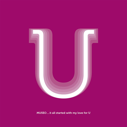
I fall in love with MUSEO at the first sight when I saw it at MyFonts Newsletter and this. I can see how a publication would look beautiful just set in MUSEO, both display text and body text. My only regret is, it doesn't contain the italic version since it has came with such a variable weight family. They have 5 different weights, 2 are payed and 3 of them is free, available from MyFonts of total $29 (USD) only!!!. Not to mention that it has lots of open type features, like a lovely ligatures. I just could not resist the beauty of this typeface, and I bought them. Even though, I have no projects to use this typeface yet (I haven't been doing any freelance anymore). At least, I could play around with it then I'll convince the company that I've been working on to buy this worthy typeface :D.
In my opinion, MUSEO is quite a sensible semi-serif typeface that would give a nice and sweet feels as body text. Its roundness make it a good pair with typefaces like Avenir as sans. Nonetheless, the look of MUSEO is quite related to the new ARCHER from H&FJ., PMN Caecilia, and the most similar is probably with Montag then perhaps Estilo text. They are all speak in the same language but yet each is quite individual. Hence, I love MUSEO the most, perhaps its looseness and warmness look that drawn me into it, which reminded me how I love Sauna and ended up using it for my portfolio.
I was imagining that it would be even better if there will be MUSEO sans and it will!!! I read it an interview with Jos Buivenga, the creator of Museo him self, over iLT. He said that he is working on Museo sans at the moment. To be honest, I am a big fan of Jos Buivenga's typefaces. All of his typefaces is very warm hearted and unique (Although, I didn't realise that Museo was his creation in the first place). It's hard to believe that he learned creating typefaces by him self. He is quite an inspirational man for me.
What do you think of Museo? What is the most recent typeface that you bought?
ps: MUSEO would look great paired with simple condensed sans serif typeface too
Subscribe to:
Comments (Atom)